Having a freeze pane effect on HTML Table. Freeze/Fixed/Frozen the Columns and Rows in HTML Table by using CSS.
This work was inspired by an article written by Manish Malviya, and I would like to thank for his sharing of freezing the table rows columns at https://blogs.perficient.com/2021/01/18/freezing-row-and-column-in-html-table-using-css/
Video Walkthrough Guide
Examples
Example 1: As shown in Youtube Tutorial Video
Example 2: Fixed width & height
Example 3: Responsive width & height (adjusted by using viewport)
Let’s Start
Take a simple HTML Table as example:
<div class="div1">
    <table>
        <tr>
            <th>Column 1</th>
            <th>Column 2</th>
            <th>Column 3</th>
            <th>Column 4</th>
            <th>Column 5</th>
            <th>Column 6</th>
        </tr>
        <tr>
            <td>Row Data 1</td>
            <td>Row Data 2</td>
            <td>Row Data 3</td>
            <td>Row Data 4</td>
            <td>Row Data 5</td>
            <td>Row Data 6</td>
        </tr>
        <tr>
            <td>Row Data 1</td>
            <td>Row Data 2</td>
            <td>Row Data 3</td>
            <td>Row Data 4</td>
            <td>Row Data 5</td>
            <td>Row Data 6</td>
        </tr>

        <tr>
            <td>Row Data 1</td>
            <td>Row Data 2</td>
            <td>Row Data 3</td>
            <td>Row Data 4</td>
            <td>Row Data 5</td>
            <td>Row Data 6</td>
        </tr>
    </table>
</div>
Here is the CSS that does the magic:
.div1 {
    width: 600px;
    height: 400px;
    overflow: scroll;
    border: 1px solid #777777;
}

.div1 table {
    border-spacing: 0;
}

.div1 th {
    border-left: none;
    border-right: 1px solid #bbbbbb;
    padding: 5px;
    width: 80px;
    min-width: 80px;
    position: sticky;
    top: 0;
    background: #727272;
    color: #e0e0e0;
    font-weight: normal;
}

.div1 td {
    border-left: none;
    border-right: 1px solid #bbbbbb;
    border-bottom: 1px solid #bbbbbb;
    padding: 5px;
    width: 80px;
    min-width: 80px;
}

.div1 th:nth-child(1),
.div1 td:nth-child(1) {
    position: sticky;
    left: 0;
    width: 150px;
    min-width: 150px;
}

.div1 th:nth-child(2),
.div1 td:nth-child(2) {
    position: sticky;
    /* 1st cell left/right padding + 1st cell width + 1st cell left/right border width */
    /* 0 + 5 + 150 + 5 + 1 */
    left: 161px;
    width: 50px;
    min-width: 50px;
}

.div1 td:nth-child(1),
.div1 td:nth-child(2) {
    background: #ffebb5;
}

.div1 th:nth-child(1),
.div1 th:nth-child(2) {
    z-index: 2;
}
Explanation
First of all, a DIV tag is used to contain the TABLE, providing a fixed width and height to turn a very long and wide HTML table into scrollable table.
.div1 {
    width: 600px;
    height: 400px;
    overflow: scroll;
    border: 1px solid #777777;
}
The attribute of “overflow: scroll” will make the table scrollable.
For building a responsive table, the CSS function “CALC” can be used to auto calculate the width, such as:
.div1 {
    height: calc(100vh - 250px);
    width: calc(100vw - 100px);
    overflow: scroll;
    border: 1px solid #777777;
}
Please note that the space is required in between the CALC values.
For example, this is wrong:
height: calc(100vh-250px);and this is correct:
height: calc(100vh - 250px);“vh” or “vw” are “Viewport” units.
100vh= 100% visible height, it’s something like window size, it refers to the visible area.100vw= 100% visible width.
Styling the TABLE
.div1 table {
    border-spacing: 0;
}
border-spacing: 0, eliminates the empty distance between cells
Note that the attribute of “border-collapse: collapse” cannot be used in this case. This is because the border line will behave incorrectly with “position: sticky” which will be discussed later below.
Styling the “TH” (table header)
.div1 th {
    border-left: none;
    border-right: 1px solid #bbbbbb;
    padding: 5px;
    width: 80px;
    min-width: 80px;
    position: sticky;
    top: 0;
    background: #727272;
    color: #e0e0e0;
    font-weight: normal;
}
position: sticky, this will make theTHcells always stay at top positiontop: 0, this tellsTHcells to always stay at position 0 (zero) measured from topbackground, without background color, the bottomTDcells will “crash” intoTHcells, making them overlap with each otherwidth, min-width: this is used to fix the column width, without these attributes, the cell columns will be deformed and compressed
This will freeze the “Header”.
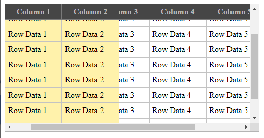
Freezing the 1st Column
.div1 th:nth-child(1),
.div1 td:nth-child(1) {
    position: sticky;
    left: 0;
    width: 150px;
    min-width: 150px;
}nth-child(1)means the first element in each “TR” block. Refers to 1st column.left: 0tells the cells to “freeze” at position zero from left.
Freezing the 2nd Column
.div1 th:nth-child(2),
.div1 td:nth-child(2) {
    position: sticky;
    /* 1st cell left/right padding + 1st cell width + 1st cell left/right border width */
    /* 0 + 5 + 150 + 5 + 1 */
    left: 161px;
    width: 50px;
    min-width: 50px;
}
Calculation of next cell position is: Border Width + Padding + Cell Width
In this case, 0 left border width + 5px left padding + 150px (1st cell width) + 5px right padding) + 1px right border width = 161px.
Hence, left: 161px
Next, when the table is scrolled to the right, the non-sticky cells will be crashing into and overlapping with the 1st and 2nd frozen cells.
Provide a background color for 1st and 2nd frozen cells to fix the overlapping issue:
.div_maintb td:nth-child(1),
.div_maintb td:nth-child(2) {
    background: #ffebb5;
}
Now, the first two frozen “TH” and “TD” are both “sticky”. Since “TD” is created after “TH”, when the table is being scrolled down, the “TD” will stay on top and cover up the “TH”, making “TH” hide under “TD”.
Thus, we can set the CSS value of “z-index” of “TH” to override it’s layer to be brought to front/top, so that “TD” will now go under/behind “TH“.
By default, all elements has default value of “z-index=0“.
.div1 th:nth-child(1),
.div1 th:nth-child(2) {
    z-index: 2;
}
Done 🙂